Adventures in Cold Emailing (and a Bit of Shameless Self-Promotion)
I've been interested in data visualization since the NY Times made it a staple of their reporting. When I decided to focus on developing full stack web applications during my time at the Recurse Center, I knew I wanted data visualization and D3 to be a big component of the app I'd be building. I ended up creating Bridge.watch, an interactive data visualization platform for examining bridge infrastructure related data in the U.S.
I worked on the project on and off during and after my batch and got it into a semi-polished and stable version by mid-November, right as the Infrastructure Bill passed in the U.S. While I thought it was a great portfolio project, several of my friends encouraged me to try and do more with the project, since it can be used to look at the National Bridge Inventory data in a number of unique ways. What follows is a timeline of how promoting the project has gone, since I do not have any connections to journalists, data journalists, or data visualization experts as part of my network.
November
November 14, 2021
I first write about Bridge.watch on my blog, which gets automatically published to the Blaggregator, an internal blog aggregator for the Recurse Center community.
November 16, 2021
Bridge.watch is featured on Joy of Computing, another Recurse Center link aggregator.
November 17. 2021
I post a thread on Twitter about Bridge.watch after President Biden visits an ailing steel bridge in New Hampshire. My husband also cross posts to Facebook (which I never go on). I get only a little engagement on Twitter, but its the highest source of traffic according to Plausible.
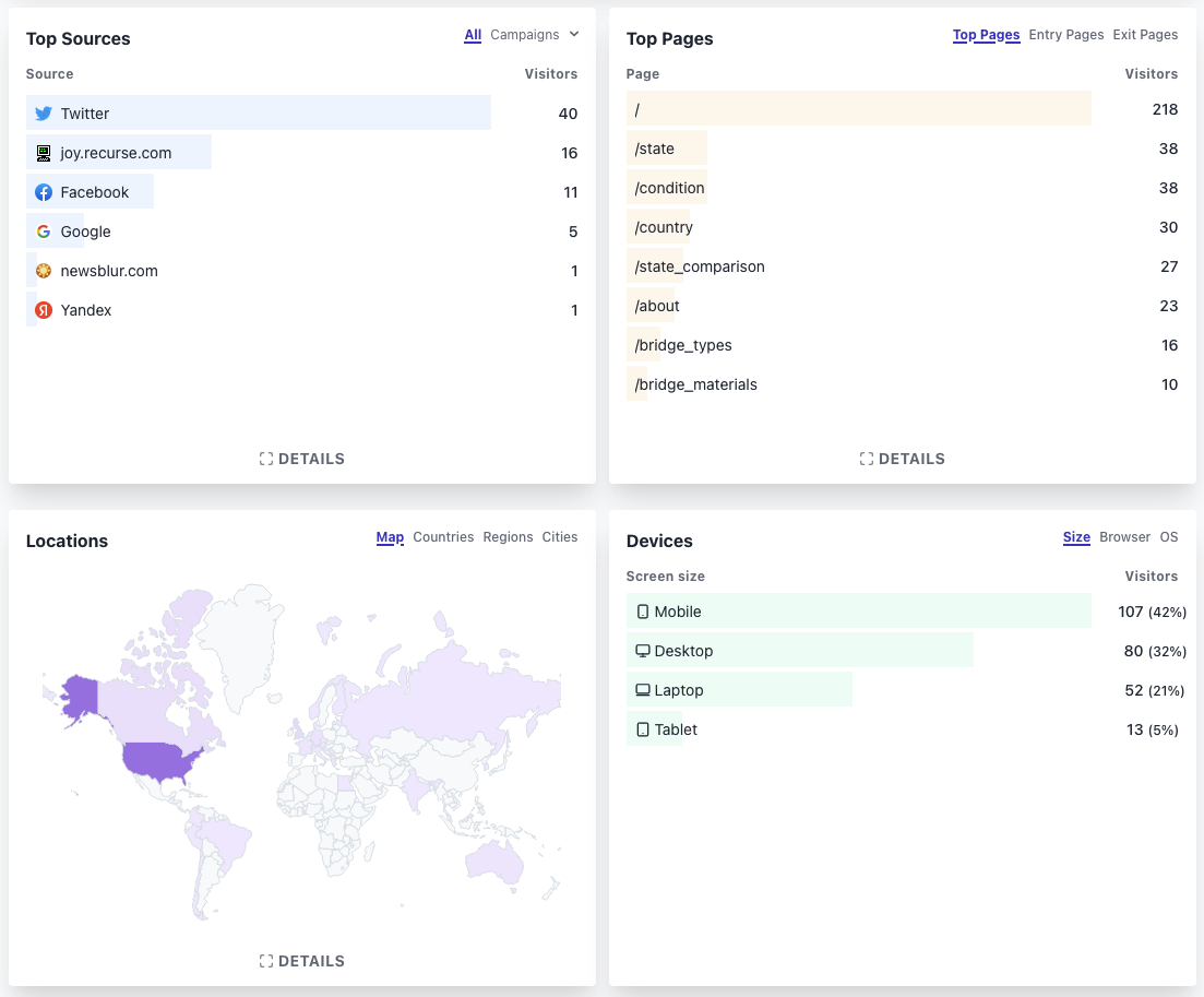
I also posted to the Data Visualization Society's slack channel, and got some good feedback (and a bit of critique). One of the biggest challenges of this data visualization project has been figuring out how best to present the information on mobile (where a lot of visitors were coming from). I still haven't found a good solution for the overall country map on mobile, because it's difficult to fit an interactive map with reactive bar charts on the same screen.
December
Shortly after starting to post about the project in November, I experienced a series of personal and professional setbacks that knocked me over for the remainder of the year. I made a few feeble attempts to promote the website.
December 3, 2021
I reach out to a Washington Post journalist via email (note: The Washington Post is one of the few news outlets that actually has their journalists' email) who does a lot of data visualization, and has covered infrastructure in the past. I get no response to the email or the Twitter followup I attempt a few days later (by this point the Infrastructure Bill is no longer in the news because Omicron is dominating the news cycle before the holidays).
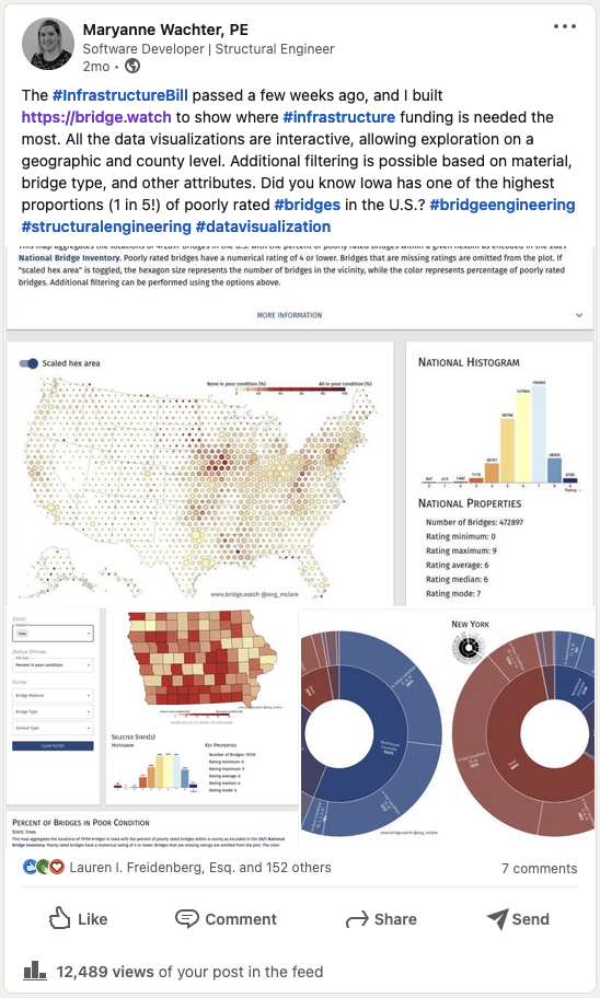
I also make a LinkedIn post :grimacing:, which gets a lot of engagement from my network (~12.5k views), but very little follow through in terms of actually playing with the website (i.e. trying new queries and filtering). My favorite comments on the post are the ones that are clearly autogenerated botting based on keywords that have nothing to do with the actual content of the post.
December 9, 2021
I discover that the NY Times has Visual Op-Ed submissions. I write up a draft with bullet points looking at New York specific infrastructure trends, submit the draft.... and get a "This email account is no longer monitored" auto-reply. Unfortunately, it looks like this division has been folded into the larger Op-Ed submittals. I send in a draft essay to the general op-ed form and am rejected almost immediately.
I tweet a few times throughout the month about various things I'm learning from the data and use relevant hashtags judiciously. I also start to @ relevant accounts (like @ASCETweets, @USDOT), but it doesn't look like those accounts are really monitored.
January
I was pretty busy in January playing catch up on other project responsibilities and dealing with our adoption of two kittens (cat tax below). I did finally incorporate a feature to add permalinks to queries so that it would be easier to share queries on the data (and link to them on Twitter).

At the end of January, there was yet another bridge collapse in the U.S. While I've been working on Bridge.watch, there was also a pedestrian bridge collapse in D.C. and there was a near miss with a steel truss bridge where one of the chords fractured.
January 28, 2022
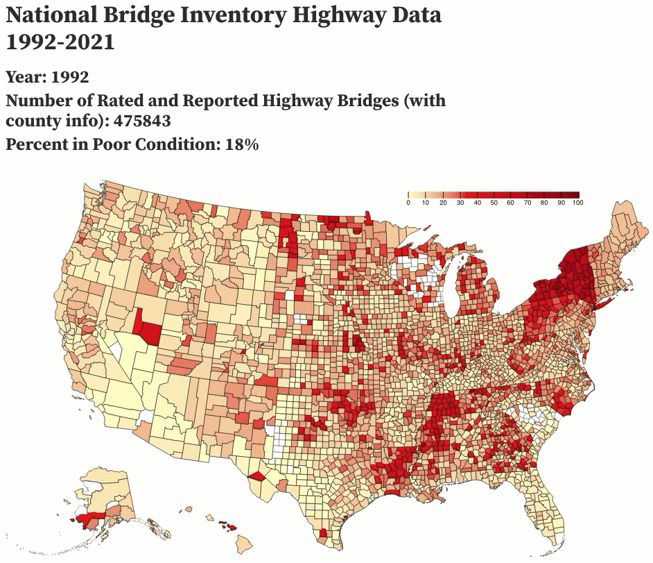
I decided to test the waters of /r/dataisbeautiful and posted an animation of the past 29 years of highway bridge data, which I complied using a few Python scripts and animated using Observable. I got overwhelmingly positive responses to the post, which also showed me some of the pitfalls of how the data could be interpreted (a number of people assumed that the rating system must have changed to make bridge conditions look better than they actually were, and my comments clarifying that the rating system has been the same since at least December 1995 were lost in the shuffle).
February
February 1, 2022
I decided that showing was a better option than telling (given the low levels of extended engagement on the actual website), and started to write blog entries under blog.bridge.watch to demonstrate how Bridge.watch could be used to create data stories. I hope to post there about once a week (time permitting).
February 9, 2022
After the positive response on Reddit, I decided to go back to cold emailing and see if I could get any more interest. I emailed journalists at the NY Times, Washington Post, and Reuters, who had previously covered bridge and infrastructure news in the U.S. (or were on the transportation desk for their respective publications). So far I haven't gotten any responses. I emailed the contact person at the FHWA to see if they'd be interested in featuring Bridge.watch alongside their standard data visualization tool, the LTBP InfoBridge Web Portal, with no response yet. I also emailed the folks at ASCE who create the America's Infrastructure Report Card, which has some very limited data visualizations that are based on the InfoBridge platform (also no response yet).
On a whim, I emailed Jeremy Singer-Vine, who curates a wonderful newsletter every week called Data Is Plural. While he had previously featured the dataset in a past edition, he kindly pointed me to a few data visualization blogs that he thought were suitable for this kind of work. So after 20+ cold emails, I finally got a response :laughing:!
Conclusions
So where do I really want this to go, and what's the point of all this? I'd really like this data to make it into the right hands to help people make better decisions about what we do with infrastructure funding. I recently discovered that about half of the funds that will be disbursed as part of the Infrastructure Bill will be on a competitive basis, and many counties are ill-equipped to submit competitive bids to take advantage of the windfall. I also like making information about the built environment more visible and accessible to laypeople.
In general, I'm also pretty bad at talking about what I work on and what I like to do, so this has been a good outlet for demonstrating the types of things I can tackle and what I enjoy doing (and would like to do for $$). I'm a pretty general purpose programmer and digging into this infrastructure information, setting up the database, and crafting the front end was just plain fun. I feel like there's a huge gap in terms of how public data is used in the built environment, and I'd like to keep picking apart big datasets like this to see what they can tell me about the current state of the industry.