Visualizing EC3's EPD Database
The data
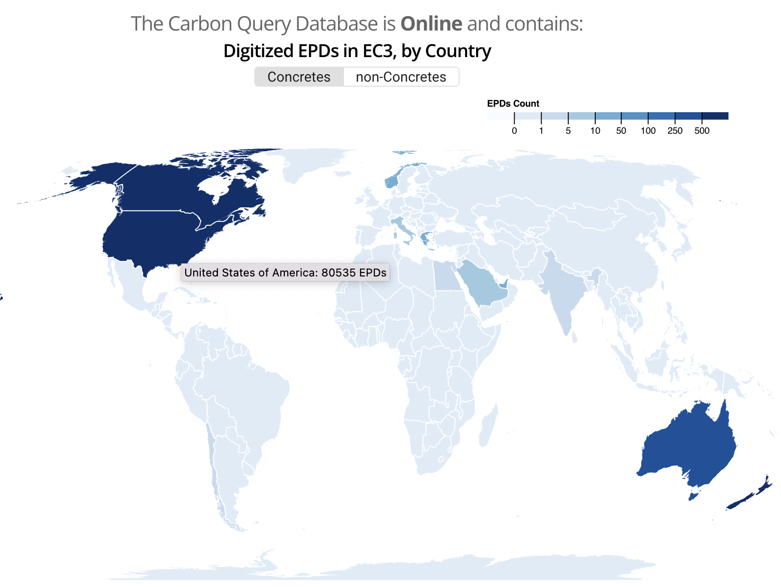
I wanted to create a data visualization of the current state of the EC3 Environmental Product Declaration (EPD) database (provided by Building Transparency) to allow users to get a better overview of their current offerings (their current landing page provides a broad count of EPDs by country, only differentiated by "concrete" vs "non-concrete" in a global map).
Environmental Product Declarations are crucial for estimating the embodied carbon in building construction, as they provide information about the cradle-to-gate (Life Cycle Assessment A1-A3 stage) environmental impact of building materials on a plant/manufacturer and product specific level. I thought it would be interesting to allow users to see how many EPDs have been provided on a manufacturer and plant level basis, as well as some overall metrics of the EPDs being provided by a given plant.
Here are some of the questions I wanted to answer via the visualization:
- How dominant are certain manufacturers in providing EC3 with EPDs?
- How diversified are manufacturers? Are they providing EPDs in multiple material categories and subcategories?
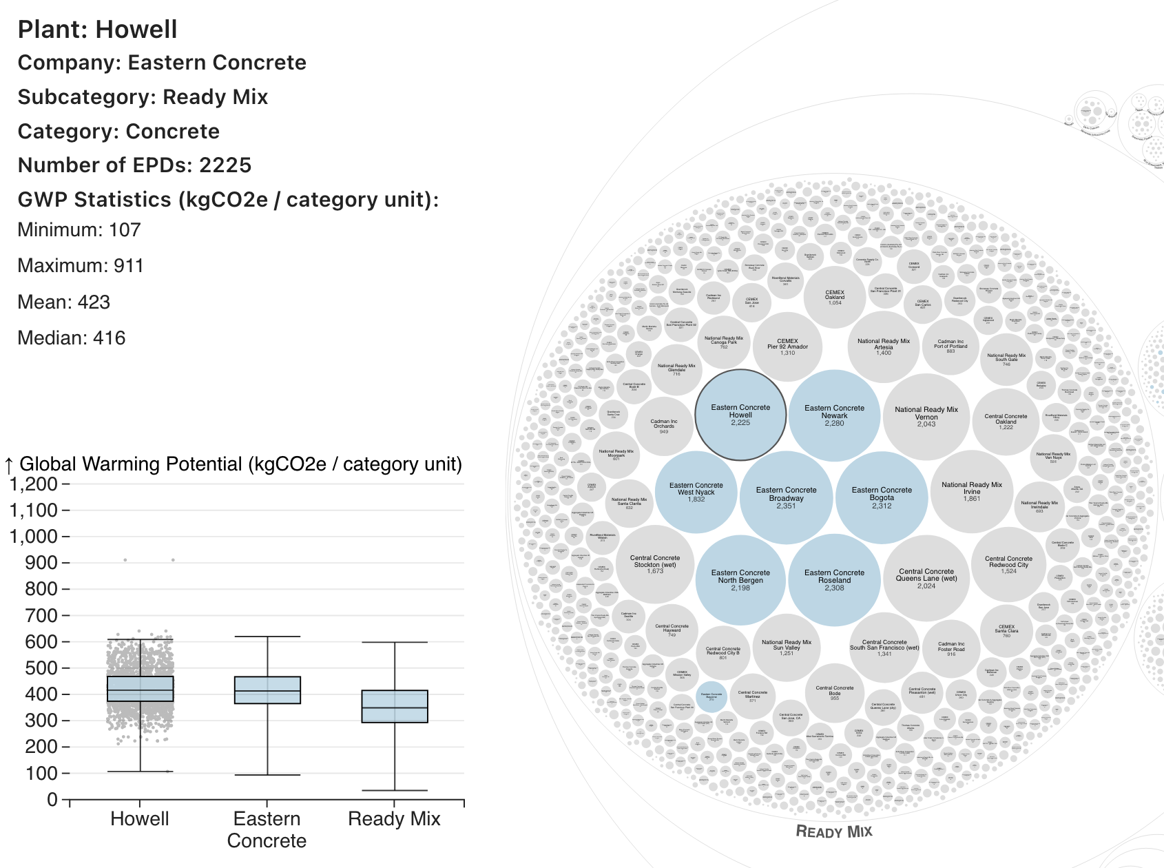
- How do the EPD embodied carbon values at a given plant for a material stack up against manufacturer and category averages?
- Where are there EPD "deserts"? Are only plants in specific parts of the country currently providing EPDs to Building Transparency?
Data collection
The first challenge for this project was retrieving all the data. It's no surprise that the EC3 API is rate limited, and that the limit is unpublished. I ended up using the Bottleneck package to prevent API calls from happening more than once every 2 seconds (I was unable to get concurrent requests to work in any capacity). I also limited the fields to return, as I didn't want to get everything out of the EPD (each one has nearly 100 fields, many of which are null). Even so, with 9 fields and about 90k EPDS, I ended up with a json file of about 400 mb. This was largely because two of the fields I retrieved ("manufacturer" and "plant_or_group") also contained a number of subfields that I didn't necesarily want. There's no way to prevent retrieving all of the nested subfields (one of the pitfalls of overfetching with a REST api), so I needed to do a bit of postprocessing to reduce the file size to only the fields necessary for the data visualization.
Initial exploration
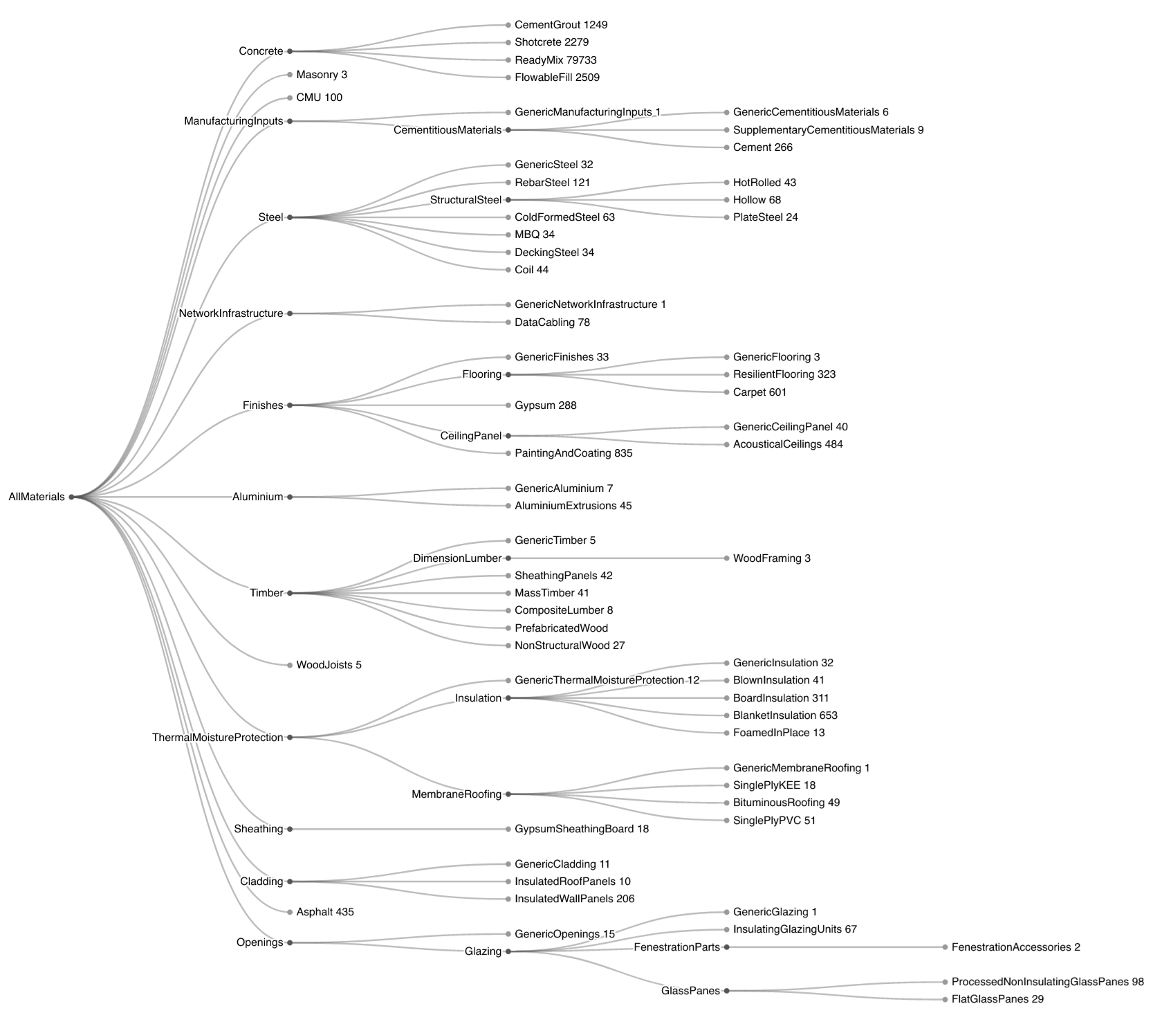
To get a general idea of the data, I used the 'categories/root' endpoint to get an overview of which material categories and subcategories existed, and how many EPDs were in each of those. A cluster dendrogram revealed that concrete and its subcategories make up the vast majority of EPDs submitted to EC3 (which shouldn't be a surprise, since there are infinite possibilities for concrete mix designs). The dendrogram also revealed that there are some unused categories within EC3 (either deprecated or reserved for potential future use).
Choosing a visualization scheme
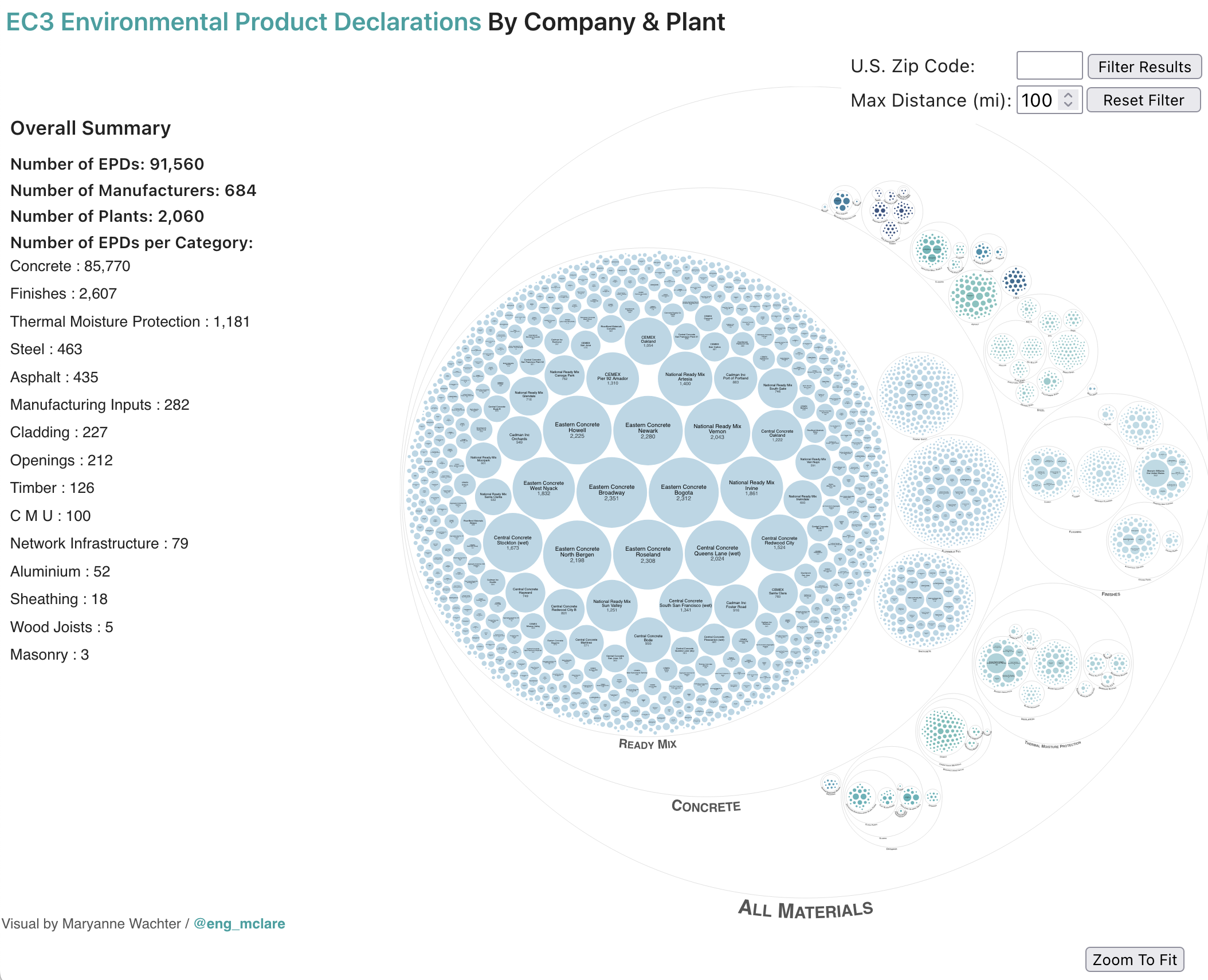
Once I had an overview of the data, I utilized a circle packing visualization to display the overall EPD information, and to group the EPDs by material category, material subcategor(ies), and by plant. Circle packing visualizations are not the most efficient data visualizations, but I wanted something with visual impact where additional information could be discovered from interactive features on the larger visualization.
While the overall plant was of interest, I wanted to have some way of teasing additional information out of the individual EPDs. I used a box plot to allow users to compare the Global Warming Potential (GWP in kgCO2 equivalent per category unit) of a product at a particular plant vs. that type of product at all plants for the given manufacturer, vs. the product category overall. I didn't like the base implementation of a box plot from D3, but I found a great example by Shruti Mukhtar to further tweak. To emphasize the difference in companies contributing EPDs, I also integrated a fade out upon hover to indicate all of the relevant plants for a given manufacturer.
Adapting for mobile
Making dense data visualizations work on mobile is hard. To facilitate use on mobile, I added some zooming and recentering features and made sure that the hover actions on desktop worked as touch selections on mobile. I also added dynamic text resizing to improve readability on mobile.

Other features I added to the visualization
- Creating custom paths (including text paths) for adding context to the large categories
- Adding a dumb version of geo-filtering by U.S. zip code based on this dataset, since the raw data file size wasn't too taxing
Updating the plot
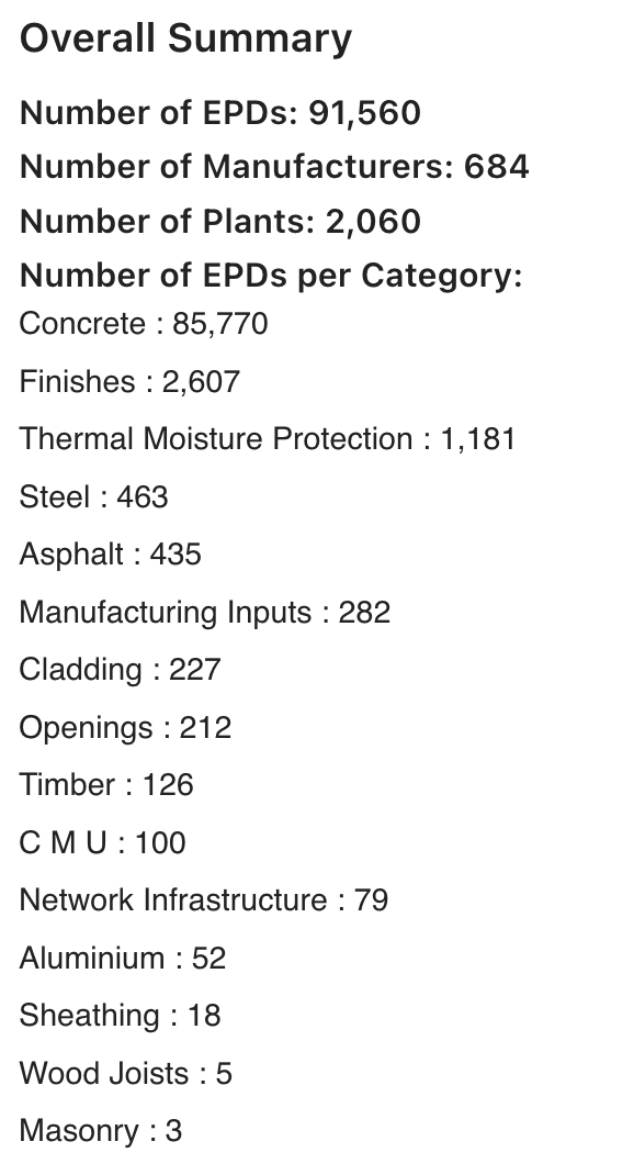
I completed the first "draft" of this data visualization in August 2022 and wanted to update the data to align with this blog post. The number of "active" EPDs in the EC3 database has nearly doubled since I last pulled information. My guess is a lot of the "date validity" fields in the dataset have been revised. Previously I was getting about 50k "active" EPDs, and now I'm getting over 90k "active" EPDs. EC3 has also revamped its developer experience (and changed the base API url).
However, the API is still definitely in a beta stage, and changes to the API aren't published in a newsletter or easily accessible to developers. I found the core id hashes for some of the encompassing material categories (e.g. steel) have changed in the past six months, which broke my current data processing pipeline. As it stands, I'm still finding 26 EPDs over six category hashes that don't match the current hierarcy from the API endpoint. There are also some underlying data quality issues, as a few errant EPDs have unexpected null fields (like the estimated GPW per category unit, which I would assume should never be null for a given EPD).
Future Improvements
Some of the data could use additional cleanup work and filtering on the display of box plots. A number of the smaller categories have a small sample size, and the "whiskers" of the box plot can be confusing as a result (maybe a violin plot would be a better representation for these comparisons). I'd also like to have the chart "resize" when filtering geographically, rather than just fading out the irrelevant plants, as the large amount of empty space makes it difficult to navigate a filtered data set.
The number of individual svg elements in this visualization is pushing the bounds of "good" practice within D3, with ~3000 plant circles, plus a similar number of text representation as well as the heads up display. While I was working on this project, I started reading the excellent Data Sketches book, and found that one of the authors, Nadieh Bremer, had a similar challenge with a packing visualization. She ended up working with the canvas, which I think might be the next step for me.